
Problem
Advis Gayrimenkul, a newly founded real estate company, needed a brand identity built from scratch. The brief was minimal - the only clear direction was to use red, with no further guidance.
Solution
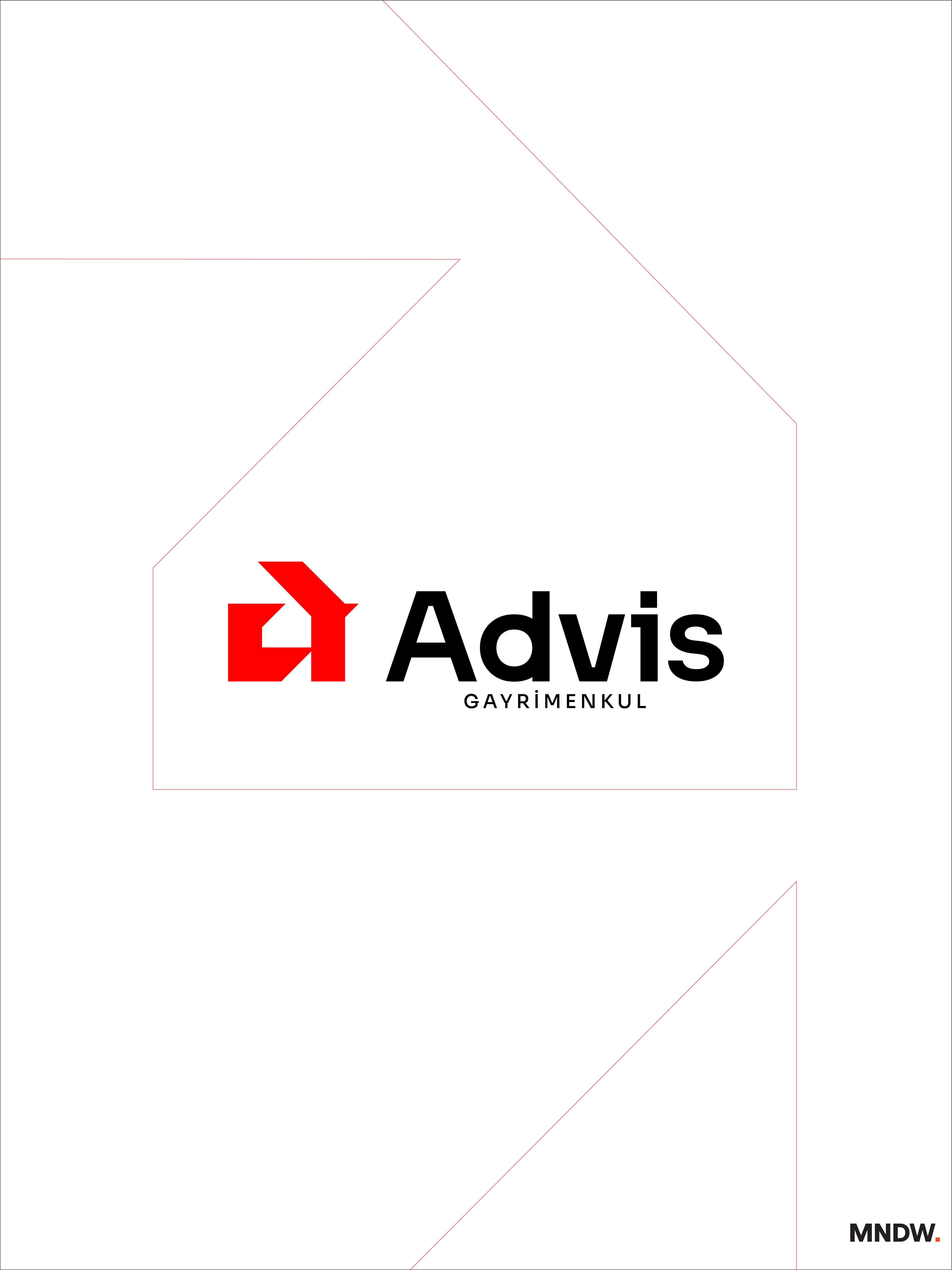
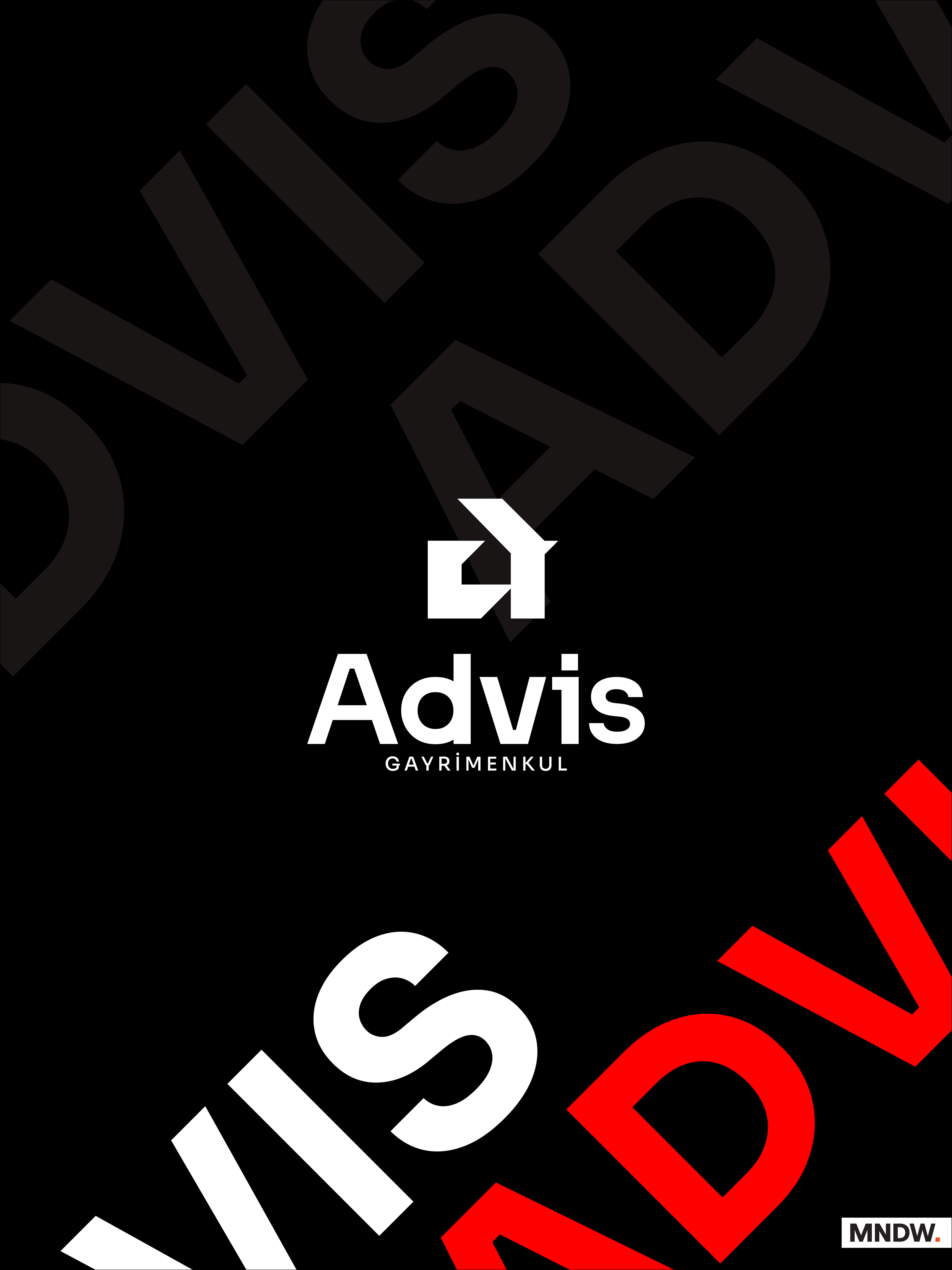
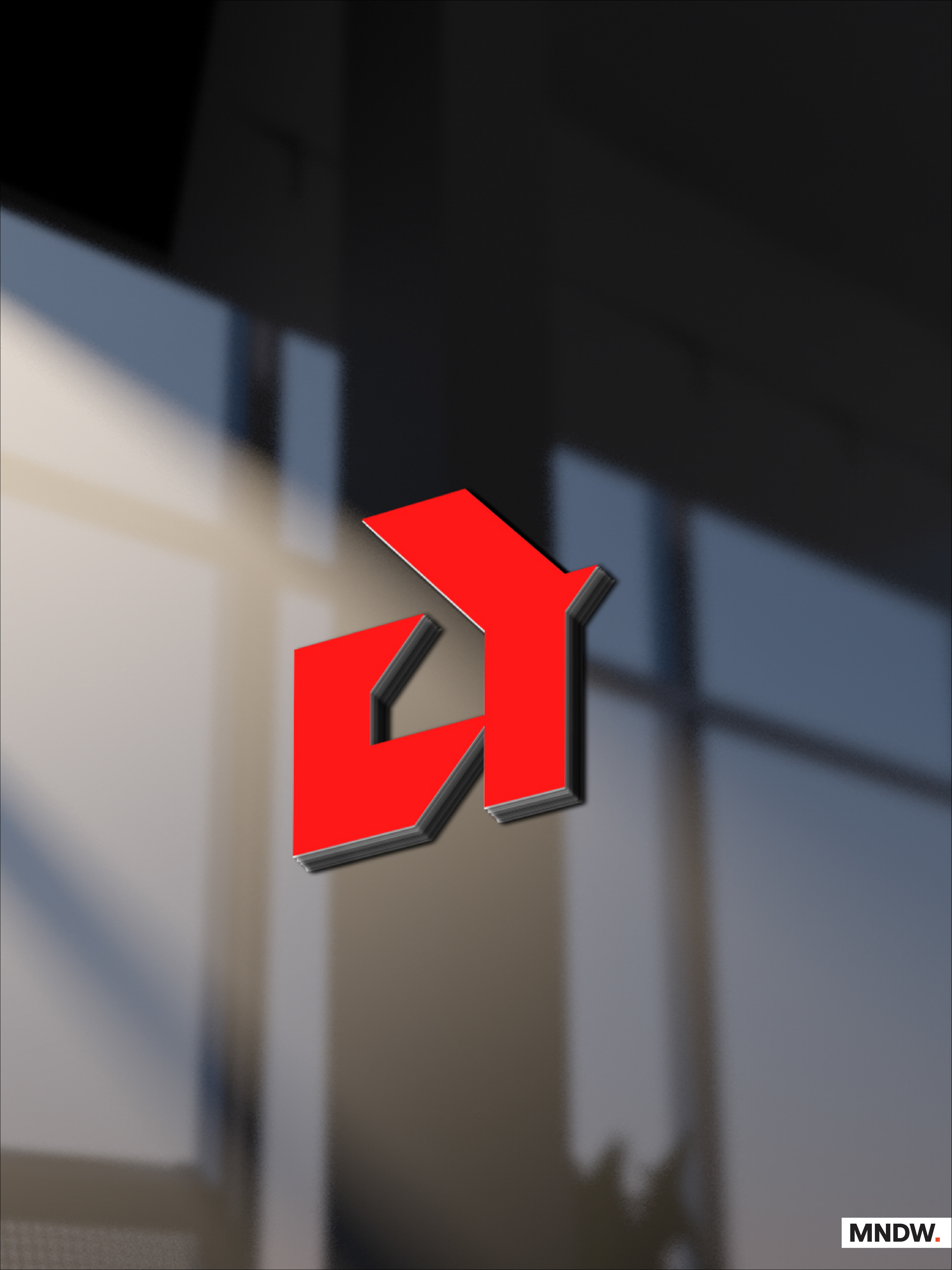
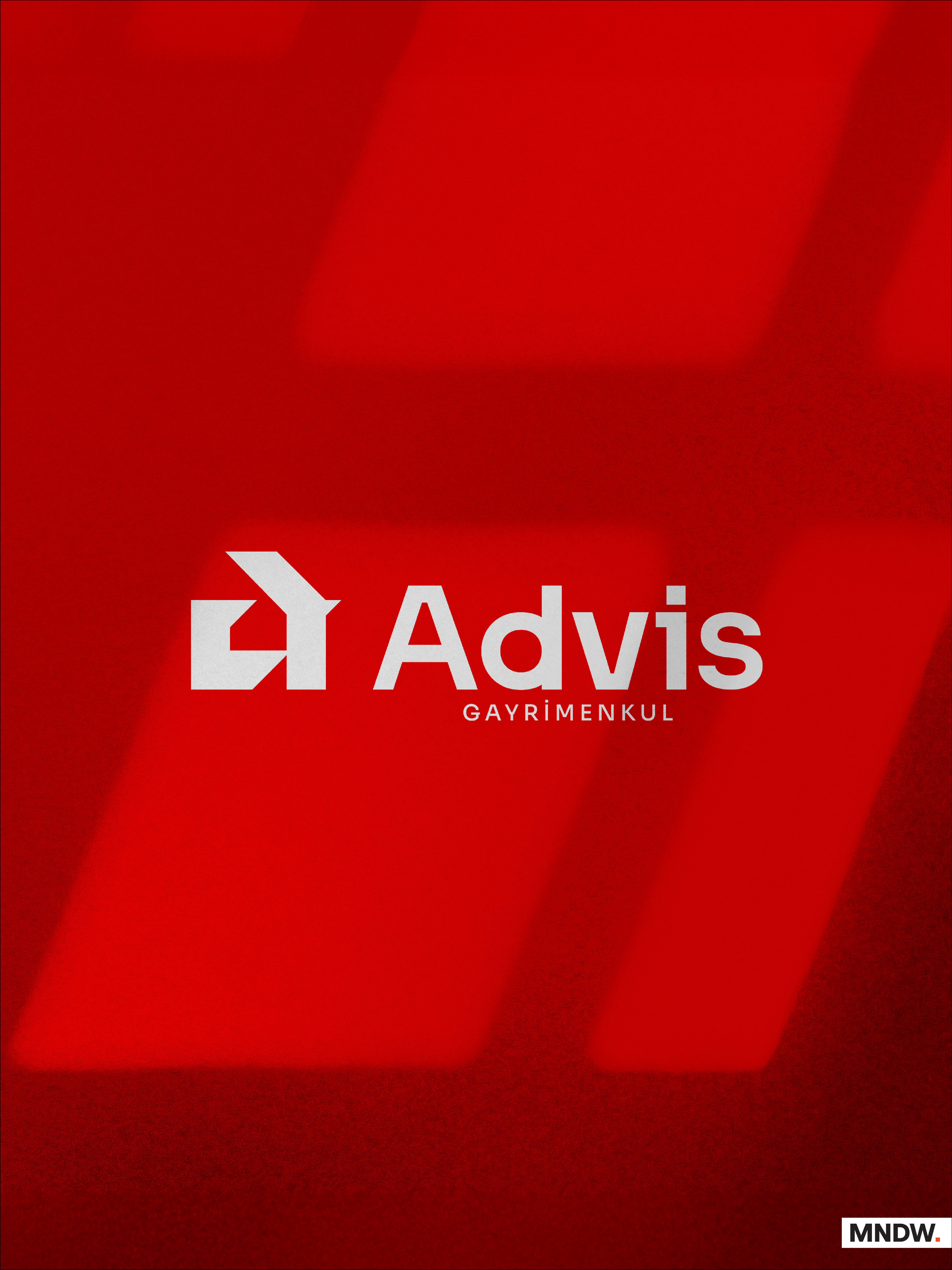
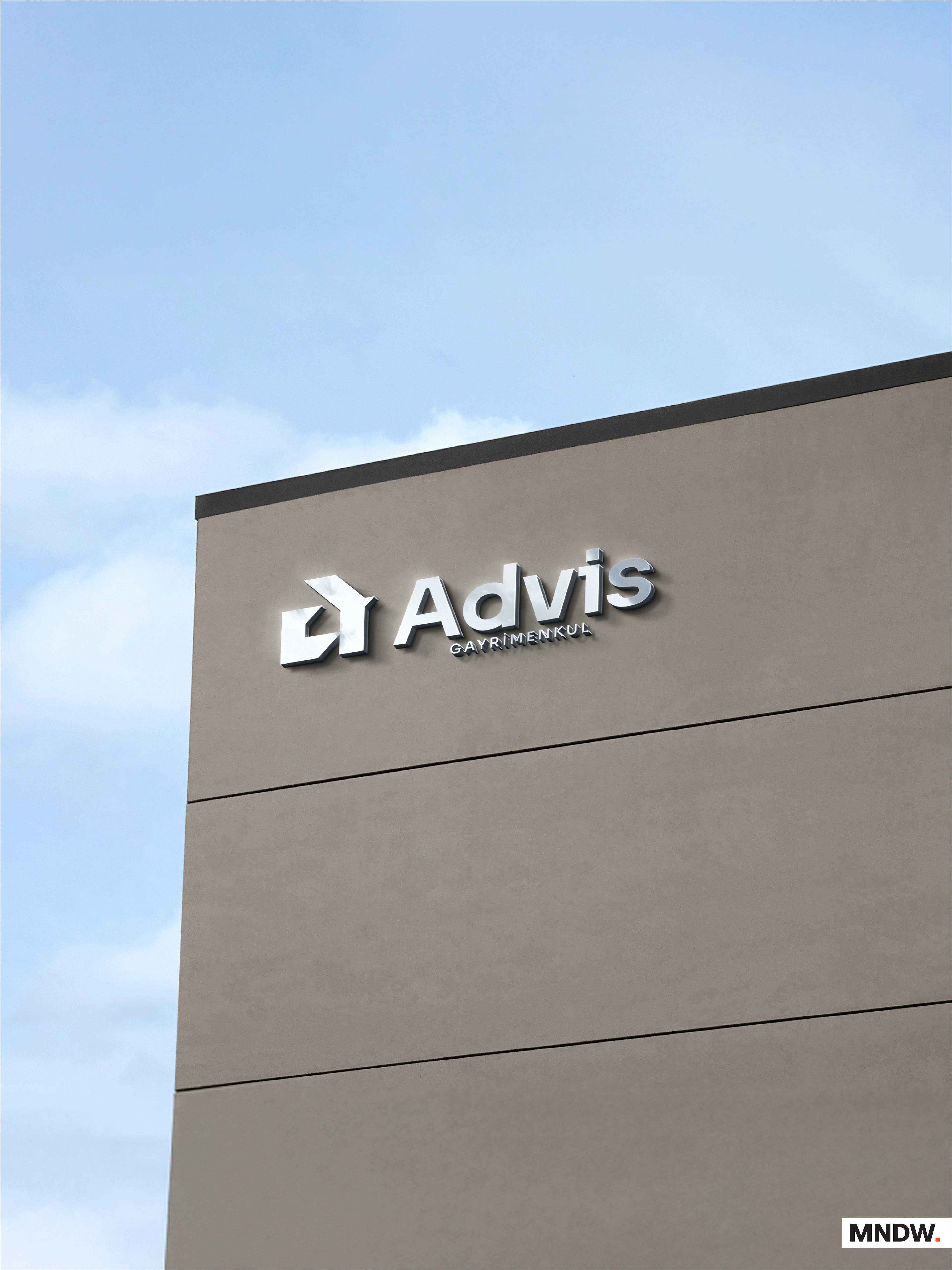
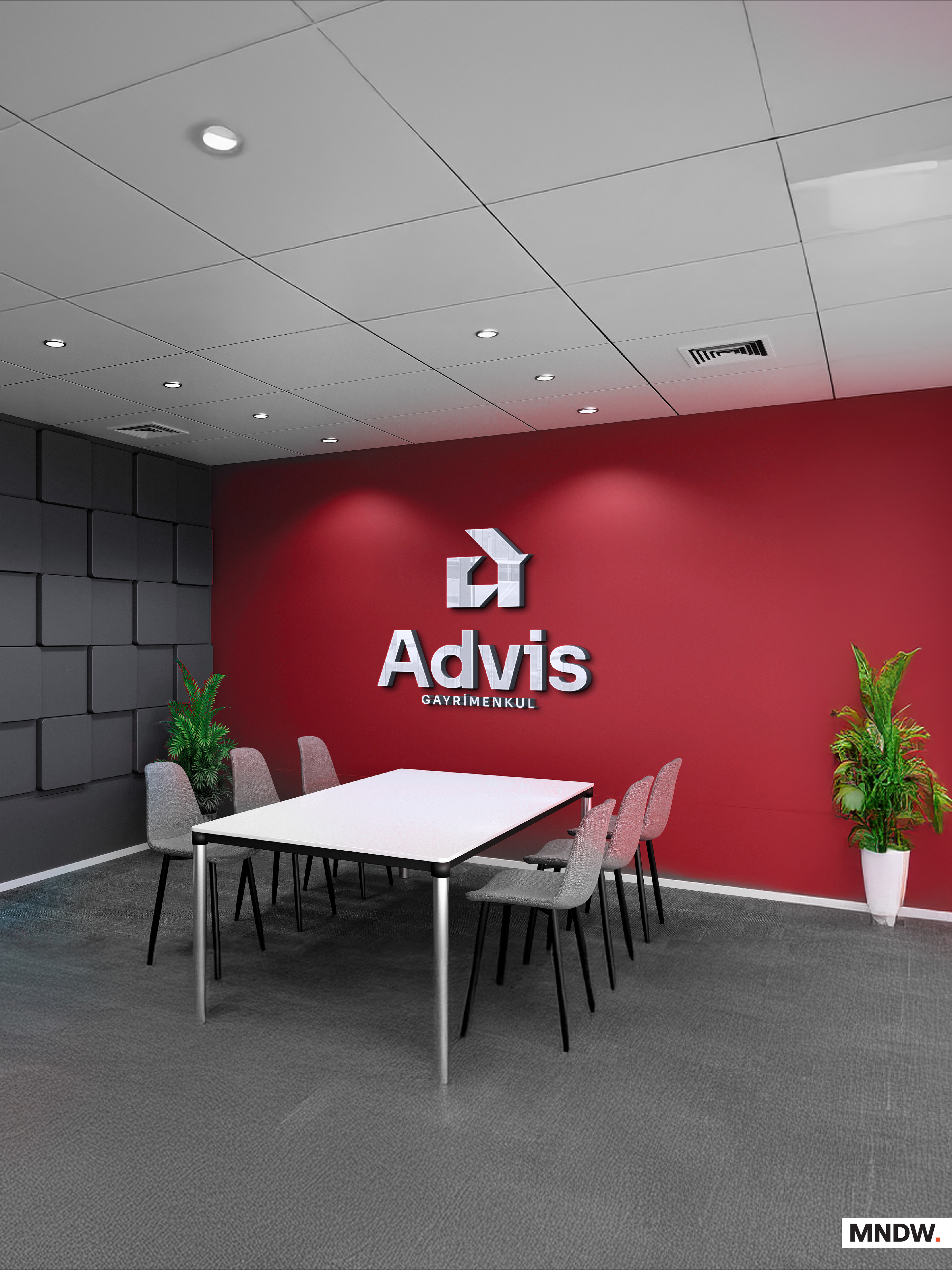
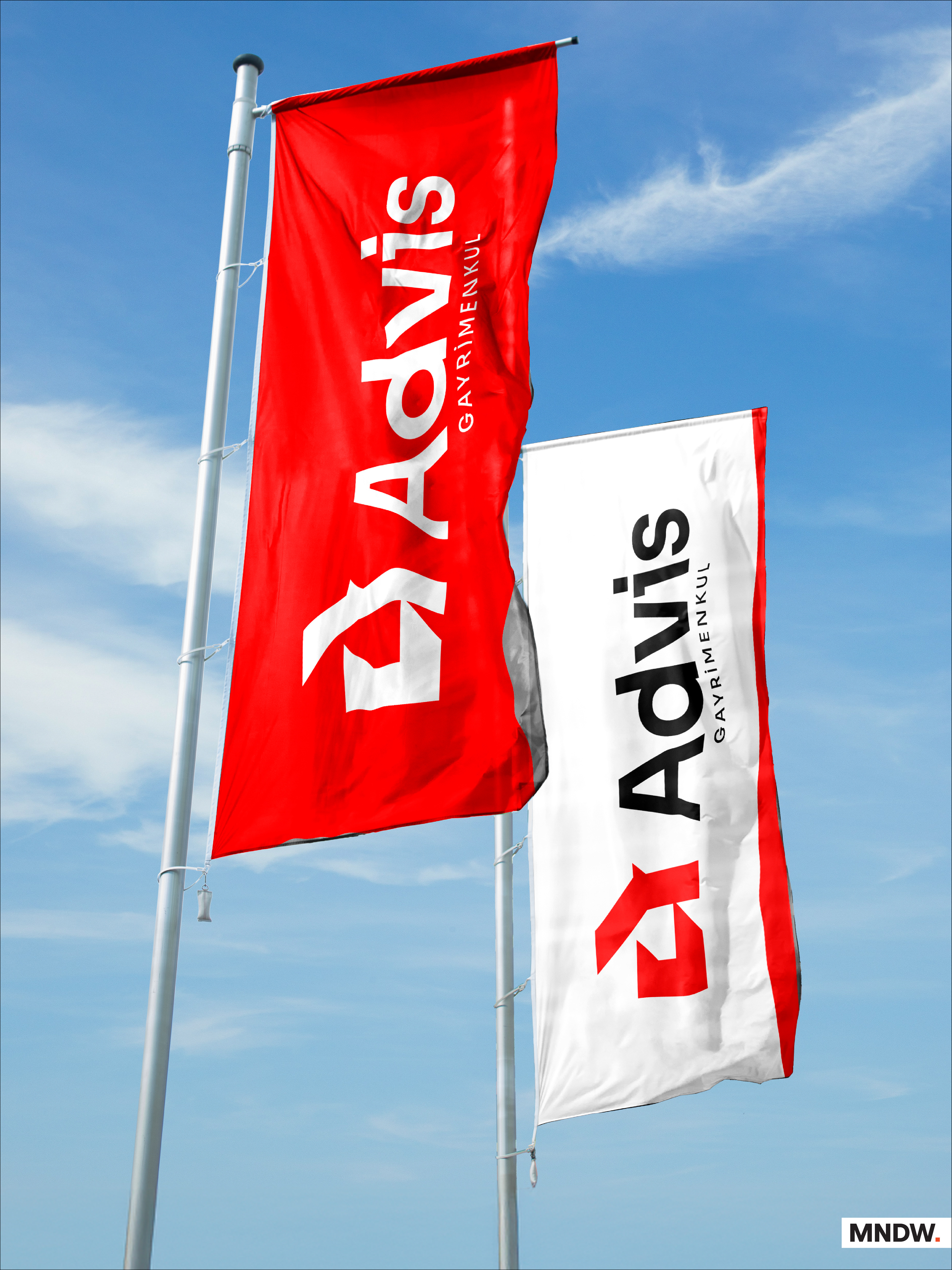
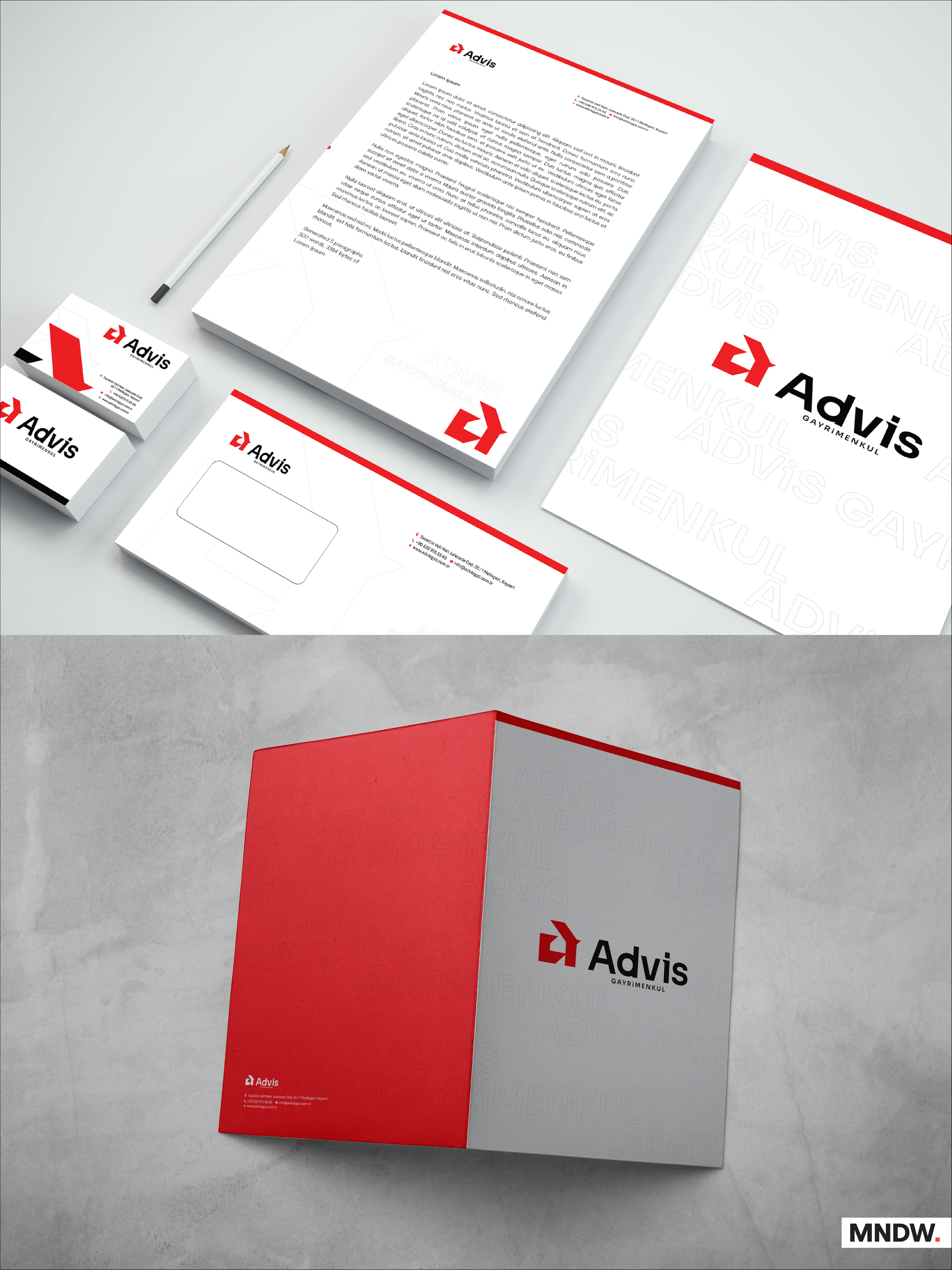
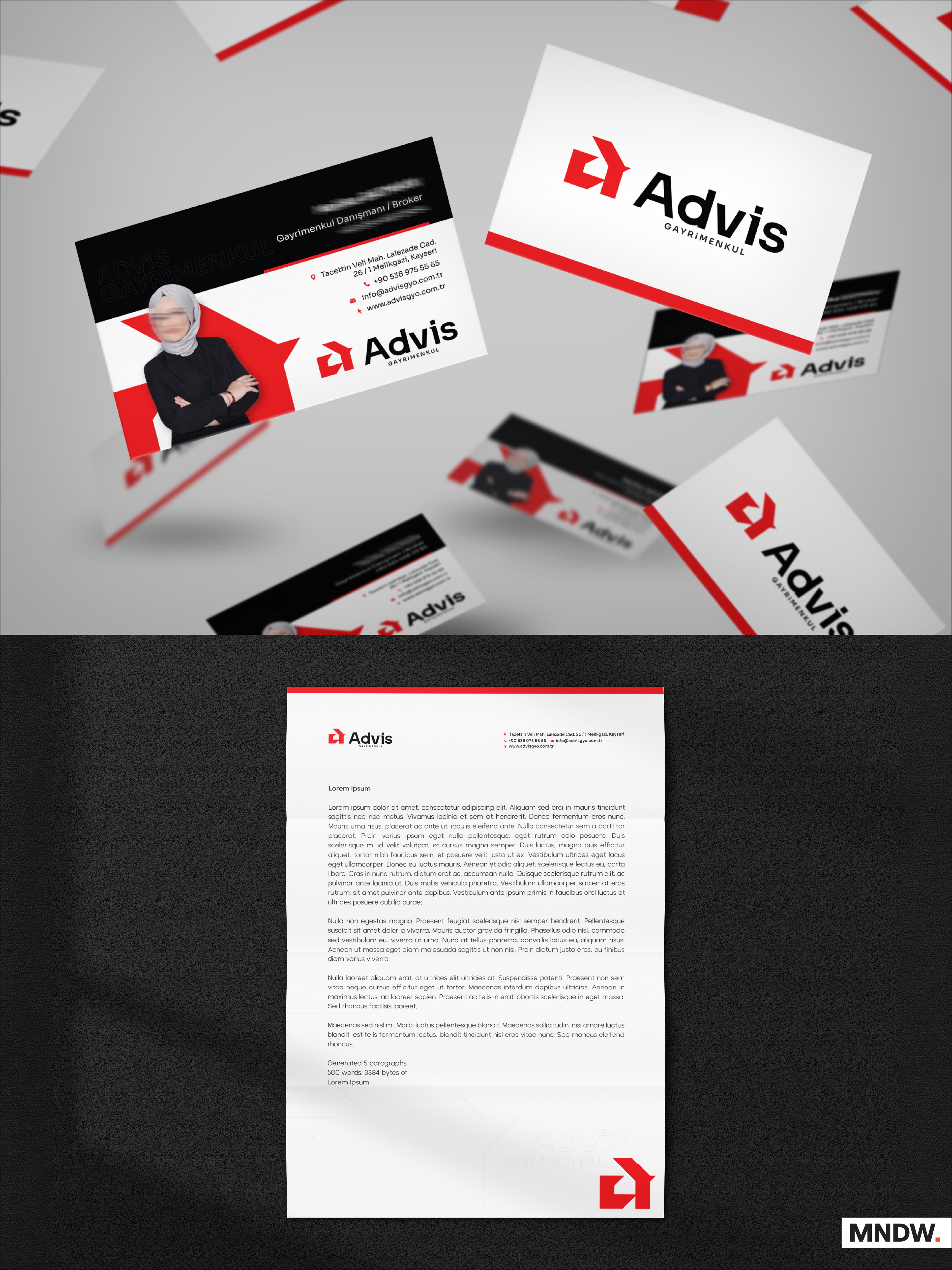
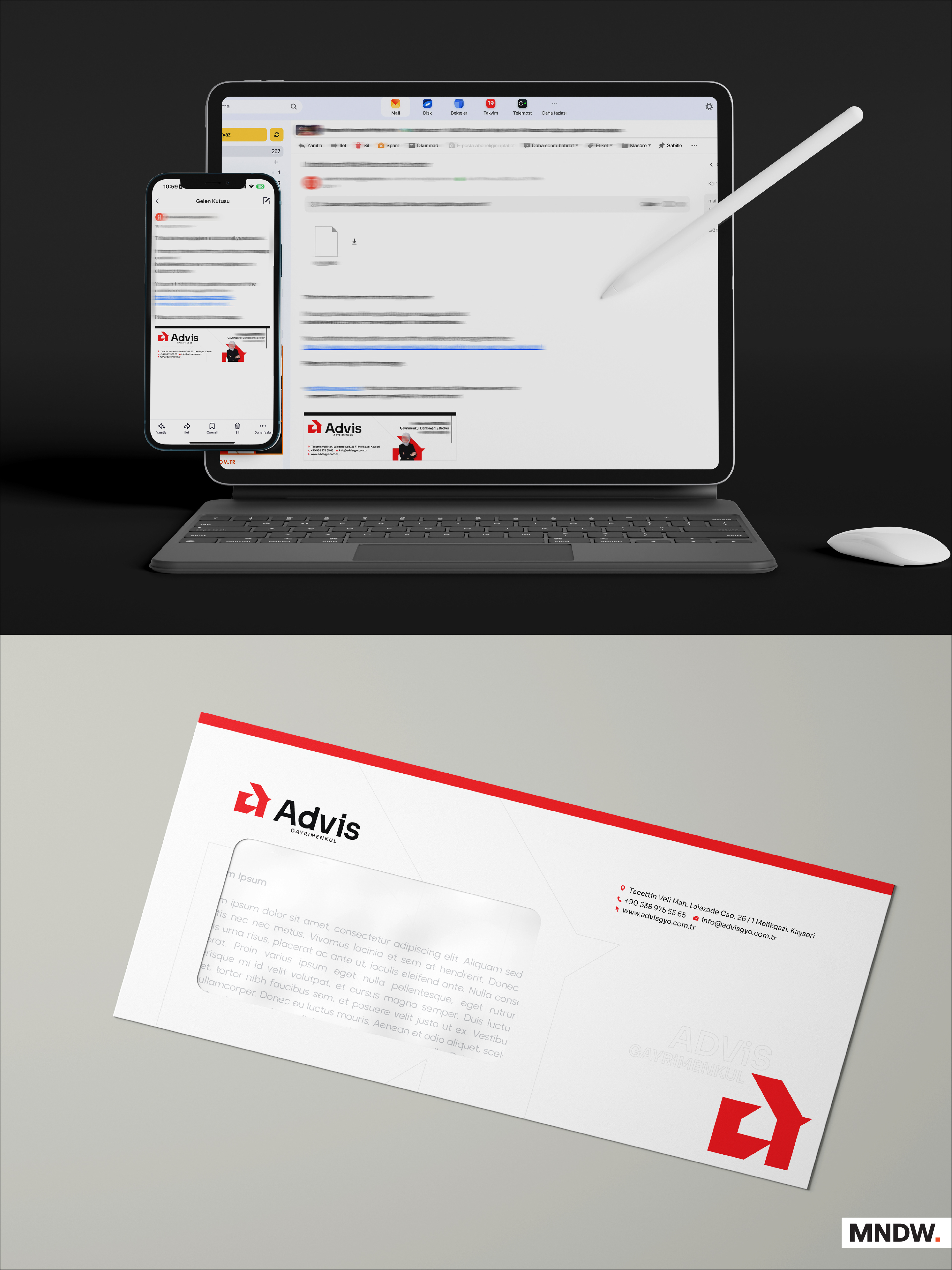
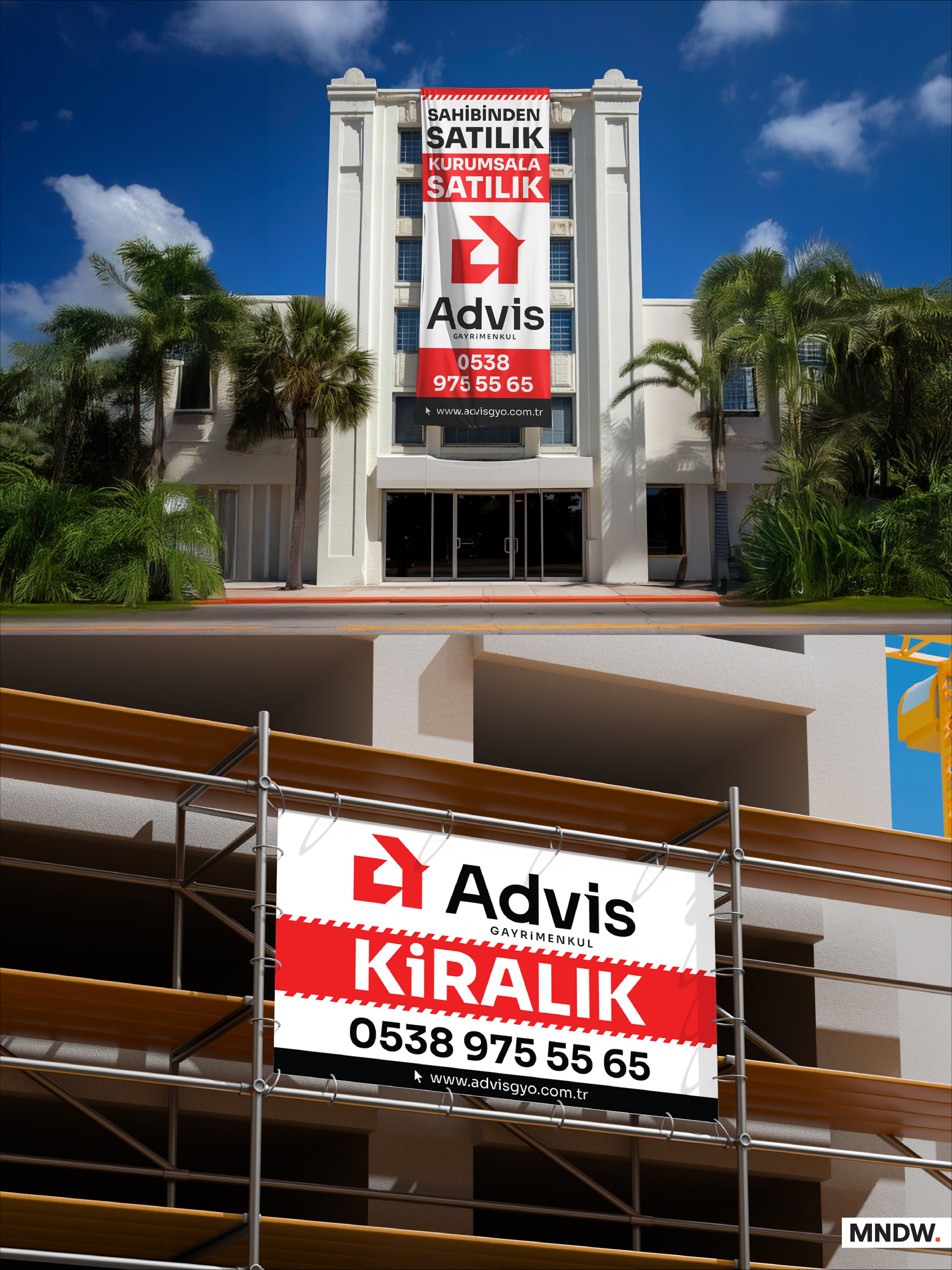
The initial letter, lowercase "a", of the brand name was redesigned to communicate both the identity and the industry at once. A house silhouette with a pitched roof was placed inside the negative space of the letter, and the top strokes of the "a" were flared outward to form the roof itself. The result is a single mark that reads simultaneously as the brand's initial and as a house - a real estate symbol built directly into the logotype. The client's one direction, red, was applied as the brand color. The logo was then extended into a full identity system, including signage and poster applications.
Result
The client approved the design. The identity system, signage, and posters were produced and are in real-world use.

Thanks for viewing
mnd.works · works@mnd.works
mnd.works · works@mnd.works